Configuring Tables in a Custom Dashboard
Configure tables with Mule app and API metrics in custom dashboards.
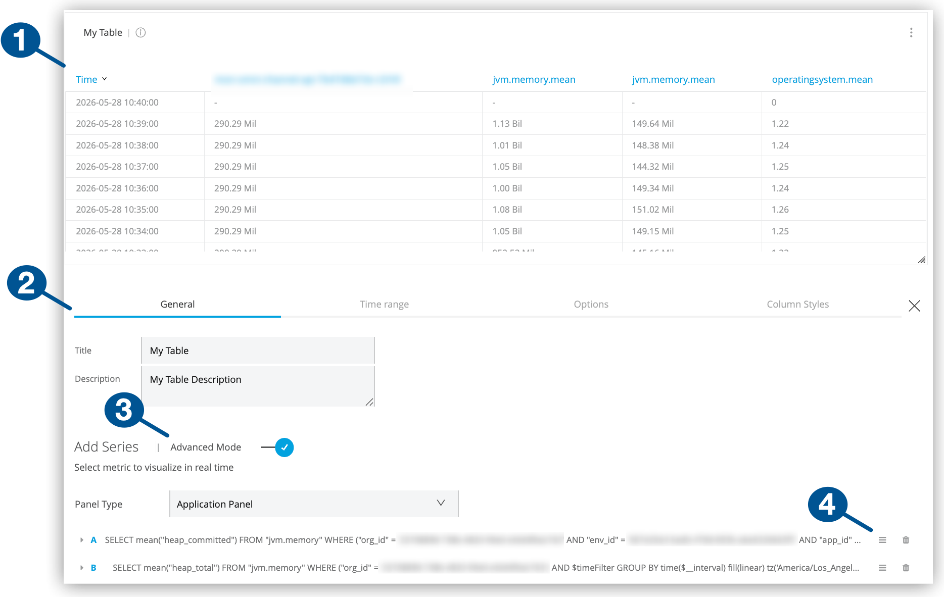
| 1 | A table configured with multiple queries in advanced mode |
| 2 | Table configuration tabs:
|
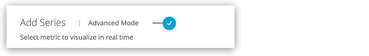
| 3 | Advanced Mode: Switch for enabling advanced configuration mode
Advanced mode support complex configurations with up to 25 queries. |
| 4 | Icons for moving, duplicating, and deleting queries from an advanced mode configuration |
Create a Table
Create a table in a custom dashboard by following the guidance in Add Charts to a Custom Dashboard.
Configure a Table
Configure a table in a custom dashboard.
-
From Custom Dashboards, open the custom dashboard that contains your table.
For guidance, see View a Custom Dashboard.
-
Click the table’s
 (More menu), and select Configure.
 -
Click the table’s General configuration tab.
-
Provide a title and description.
-
Select and configure a table mode (basic or advanced).
Both modes require environment, resource (app or API), and metric settings. For more information, see General Settings for Basic and Advanced Queries.
-
-
Optionally:
-
In the table’s Time range tab, set the table’s overrides for the time range selected by users.
-
In the Options tab, configure table layout, column, and pagination options.
-
In the Column Styles tab, set rules for table columns.
-
-
Click Apply Changes.
-
Exit the configuration view by clicking the X next to the configuration tabs.
General Settings for Basic and Advanced Queries
General tab settings include basic and advanced modes (or queries) for configuring time-series data. Both configurations share fields for the title and a short description.
| Basic and Advanced Mode Settings | |
|---|---|
Title |
Title to display in the UI. Defaults to Panel Title. |
Description |
Short description to display in the UI when users hover over the information ( |
Other settings are specific to the setting mode (basic or advanced).
Basic Mode
In the General configuration tab, a basic query selects a single metric for a deployed Mule app or API in a given environment.
| Basic Mode Settings | |
|---|---|
Panel Type |
From the drop-down menu, select the type of panel to display for the resource (Application Panel or API Panel) |
Metric |
The drop-down menu includes these types of metrics:
For a list of basic metrics, see Basic Mode Metrics |
Environment |
The environment where your application or API is deployed. |
Resource |
A deployed application. This option is available if you select Application Panel as your panel type. |
API |
A deployed API. This option is available if you select API Panel as your panel type. |
Version / Instance |
The Mule version or instance on which your API is deployed. This option is available if you select API Panel as your panel type. |
| When you create an application panel using a JVM metric, the query that supports the panel uses only the worker-id for the app. When you modify the panel at a later time, the resource fields are populated with the query content. Because some apps share a worker-id, the resource that appears in the selector might appear to be a different resource from the resource you selected originally. However, all resources share the same worker, so the query has the correct information despite the selector displaying a different resource name. |
Advanced Mode
In the General configuration tab, advanced mode settings support fine-tuned queries for metrics.
| If you switch back to basic mode, some advanced configuration queries are removed. |
| Advanced Mode Settings for Applications | |
|---|---|
From |
Lists metrics, such as This field provides matching suggestions when you type in a character. For example, For a list of advanced metrics, see Advanced Mode Metrics |
Where |
Supports conditional logic for filtering the From metric you selected.
Grouping |
Select |
Add one or more metric |
Group By |
For grouping the data by a selected time interval (such as Valid values and arguments:
|
Alias By |
You can create a label for your metric using a literal string (such as |
| Advanced Mode Settings for APIs | |
|---|---|
From |
Lists metrics, such as For a list of advanced metrics, see Advanced Mode Metrics |
Where |
Provides conditional logic for filtering the metric selected from the From field. You can select one or more filter tags (such as |
Select |
For creating a function that selects a metric field (such as |
Group by |
For grouping the data by a selected time interval (such as
|
Alias by |
You can create a label for your metric using a literal string (such as To use your tag as an alias, the tag must be included in the |
Time Range (Overrides, Time Shifts, Info Display)
Time range configurations provide a way to override relative time ranges (such as the last 30 minutes) selected from the dashboard UI by end users.
| Time Range Settings | |
|---|---|
Override Relative Time |
The amount of time covered by the statistic, for example, the last hour ( |
Add Time Shift |
How long ago the covered time range ended, for example, |
Hide Time Override Info |
Hides information about the override time range settings from the singlestat or table, such as |
Options (Data and Pagination Settings)
In the Options configuration tab, you can set layout, column, and pagination options for tables in a custom dashboard.
Data Settings (Options tab)
Provide time series data transformation, column, and paging configurations.
| Value Settings | |
|---|---|
Time Series to Rows |
Creates a table with values for a given metric at a given time period. Like Time Series to Columns, the first column, Time, is for timestamps (such as |
Time Series to Columns |
Creates a table that shows values for a given metric at a given time period. Like Time Series to Rows, the first column, Time, is for timestamps. However, there is a column for each metric, such as |
Time Series to Aggregations |
Transforms time series into a table that calculates totals, averages, and so on for a given metric. The first column, Metric, is for metrics such as Note that this example uses color-coded thresholds (see the cell coloring in the Avg and Max cells and value coloring for the Min value). |
If you select Time Series to Aggregations, you can add pre-defined columns to the table.
| Columns for Aggregations | |
|---|---|
Auto |
Columns and their order are determined by the data query. Only available setting when Time Series to Rows, Time Series to Columns, Annotations, or Table is selected. |
Avg |
Averages the recorded data for a given metric. |
Min |
Provides the lowest recorded value for a given metric. |
Max |
Provides the highest recorded value for a given metric. |
Total |
Provides the sum of all values recorded in the table. |
Current |
Shows the current value for a given metric. |
Count |
Provides the total number of data points collected on the metric. |
Paging (Options tab)
In the Options configuration tab, you can set pagination properties for tables so they don’t become too long and are more manageable.
| Paging Properties | |
|---|---|
Rows per Page |
Number of table rows allowed per page. |
Scroll |
Checkbox for making the table scrollable. |
Font Size |
Percentage of the default font size from 80% to 250%. |
Column Styles (Options, Data Types, Thresholds, Links)
In the Column Styles configuration tab, you can create (+Add) and apply rules available for table columns.
To remove a rule, you need to click it, then find and click the Remove Rule button near the bottom left of the screen.
Options (Column Styles tab)
| Options | |
|---|---|
Apply To Columns Named |
Identifies the column or columns to which the rule applies. Provide the name or a regular expression (regex) that matches the name of one or more columns in the table. For a regex, use this syntax: |
Column Header |
Provides a title for the column. For example, if you add the |
Render Value As Link |
Treats values in the column as a link that you can configure through the Link settings. |
Link (Column Styles tab)
In the Column Styles configuration tab, you can configure a link from a value to a specified web page.
Link settings are available only when Render Value As Link is checked.
| Link | |
|---|---|
URL |
Specifies a URL that you can open when you click a value in the column. |
Tooltip |
For providing a description of the link. This text appears when the end user hovers over the cell with the link. Use the same variables as for URL. |
Open In New Tab |
Displays the web content in a new browser tab when you click on the value. |
| Type | |
|---|---|
Type |
Data type for values in the column. Valid values are Number, String, Date, and Hidden. |
Unit |
Label for the unit of measure to use for the value, such as |
Decimals |
The level of precision allowed for a decimal value, for example, |
Thresholds (Column Styles tab)
In the Column Styles configuration tab, you can set thresholds for your data if Type is set to Number.
| Thresholds | |
|---|---|
Thresholds |
Comma-separated values, for example, |
Color Mode |
Indicates whether to apply the color code to the Value in a cell, to the Cell, to the entire Row, or whether color coding is Disabled. |
Color |
Color used to code values below (left-most color box), between (middle color box), and above (right-most color box) the specified threshold settings. For example, green values might represent OK, yellow a warning, and red an error. You can also invert the color coding. |